


Special Edition Review: illumicrate's The Atlas Six by Olivie Blake

I’ve known about The Atlas Six since before it was a traditionally published book. It was on my TBR, but I hadn’t purchased it when it first released in 2020 because I already had a bajillion books and I was in a panic, like everyone else in the world was, and started using all of my time planting as much food in my yard as I could instead of reading the indies that made my eyes sparkle

Fast forward to this year, and, of course, I had forgotten about the book because it was out of sight, out of mind, and suddenly, there’s a ton of chatter in the book world about a new release Tor’s coming out with called The Atlas Six. Huh. That sounds familiar. Beep boop boop beep on the internet, and there it is. Wait, this is an indie pub. More research later, and it’s now being published by a big publishing house. I don’t consider Tor an indie house, even though it started out that way, because it is an imprint of Macmillan, one of the big five houses. Even the Tor website says at the bottom ©Macmillan, which also makes me wonder why their books are on the Indie bestseller list. But, I digress. I shall step down from my soap box and focus. On to the special edition review.
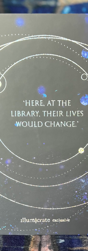
Just in case anyone thought I would be impossible to please in regard to Special Editions from box companies—I present The Atlas Six special edition from illumicrate.

Keeping in mind that this opinion is quite subjective, I will make a bold statement that my absolute favorite feature of this book is the holo foil. I haven’t seen it on a book before, and now, of course, I want it on all of them. It’s tastefully done (though I would have been okay with more of it), and it really gives the most audacious pop to all of the symbolic details on the dust jacket, the spine, and the wrap. (Though, my spine art is a bit off-center.)


The feature I feel most people will be ultimately pleased with is, I suppose, is the edges. They’re digital and wonderful. Every edge should be this detailed. I have become spoiled with edges now. Once, sprayed solid edges were the only offering, then the book world graduated to stenciled. Now, we book nerds are at digitally sprayed/printed edges, and now there really is an expectation (from me, at least) that all special edition offerings should have edges this detailed. Every time. Especially since the price of single-purchase special editions is so hefty ($50 with shipping to US!).
One drawback to the edges would have to be that I expected them to also have some holo or glitter or something. Again, I like shine and sparkle, so that is subjective. The mock-up art, to me, gave the impression of sparkle, and that was not the reality, which was a big disappointment. And my edges are a bit dull in color at the top—the blue and white look faded and the art lines are blurry a bit. That may not be the case with everyone’s copy, so I’m not going to complain too much. I know some books arrived with scratched paint and dinged spine tops and bottoms. I guess I should be grateful that I just got some dull edge art. Additionally, I would like for the edges to be digitally sprayed on all three edges and not just the fore-edge. I don’t think it’s too much to ask when the price for one book is almost as much as a box, especially considering they put such a snazzy edition in their January box, with beautiful edges on all three sides, so I know it can be done.

Anywho, on to the interior art and endpapers! These endpapers feature art from the artist who did the original character art on the indie version, Little Chmura, which I find remarkable. The endpaper and interior art being by the same artist gives a sense of continuity to the edition. The art’s also fantastic. I’m immensely glad the traditionally published version kept the interior art; it would have looked a bit puny if a self-pub could do it but not a behemoth house like Tor. It was actually the first thing I checked when I got the book out of the box.

And finally, this edition included a signature on a tip-in! I always love to have signed copies of books when possible, and I was more inclined to purchase this one over others that were offered because of the added value of the signature. I know some don't mind not having a signature, but it's a must-have feature for me, so I opted for this edition. I'm glad I did. It's fantastic. Overall, 4/5 for this edition for the fact that my edges were are bit blurry and dull and my spine is off center. Other than that, what a perfect edition!

As a post script, while I’m incredibly excited about an indie author getting more exposure and return on investment for incredibly hard work, something I can’t describe, or many somethings, bugs me about the whole thing. I think perhaps the biggest annoyance for me is that the book had intrinsic value before, but now it seems to be legitimized and “approved” because of the manner in which it is published. Big book boxes are including it for sale and giving patrons special features and (a few are including) a signature. Was this book not worth all this before it was picked up by a traditional publisher? I think so. I think self-published books are. I guess since I’m such a fan of indie (truly indie)/self-pub books, it feels like an insult. I’m glad I got my hands on an indie version as well, even though I was a bit late to the party.
Comments